Bridgeman Images is pleased to meet Stephen Brayda, Art Director for HarperVia, Amistad Books, and HarperEspañol of HarperCollins Publishers, for an interview. We love to work with Book Publishers on cover artwork or when supplying illustrations for their publications.
What was your background and path to becoming a cover designer?
SB: I started as an intern in advertising, but there was something about publishing I was always
drawn to. I jumped ship and began my publishing career as a junior designer with Penguin where I
designed for great imprints with amazing art directors over several years. In 2019 I was hired by
Judith Curr, the President and Publisher of the HarperOne Group at HarperCollins, and it's been an
incredible journey. Our imprints are so relevant and to be an integral part of their growth has been
rewarding. I now art direct four different imprints for HarperCollins.
Just for the record, which imprints are they?
SB: HarperVia, the imprint devoted to literature in translation; Amistad, the oldest imprint devoted to
books by and about people of color; HarperCollins Español; and finally, the most recently formed
Martin Luther King Jr. Library. HarperCollins acquired Martin Luther King Jr.’s entire backlist
(sermons, essays, speeches, etc.) so we’re kicking off a new initiative to repackage everything. We
have the first two titles coming out soon: his I Have a Dream speech, as well as an accompanying
The Dream Journal, something that you can purchase along with the speech to track your journal
entries for the year. So it's really inspiring to see all these come together.
We've often touched base around artists and diversity - artists from across all paths of life, all ethnicities, and from across the whole world. It's great that you've used such an array of art and photography and styles; there's a real diversity to your work.
SB: Thank you! It really is all because of the diversity of the titles, the range of writing and the
voices which allow for creative and experimental work. It comes down to what the essence of the
book is, and thankfully I have the freedom to explore.
On that note, I appreciate that every brief for every book is obviously different - but do you have some sort of general creative process you utilise when you're about to kick off a project or does it vary more significantly?
SB: I think the only consistent thing is my anxiety! I anticipate the process and then the anxiety starts
to kick in and I think ‘I have a responsibility - I actually have to make this a sellable package! ‘It
always starts with reading, though. I read as much as I can of whatever is provided and then it's just
pulling out the essence and the feeling of each book. Fiction is obviously more nuanced, so I read as
much as I can as it’s important I don't miss a critical element. Nonfiction is slightly different, but the
first step would be digging into a manuscript or brief, then sketching, and then a lot of time doing
image research.
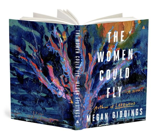
Project: Women Could Fly
That's one of my favorites and I just love that we found the perfect image. The book is striking; I
don't want to give too much away, but an island and its trees play a critical role. This image
resonated immediately. My publisher has this amazing saying: ‘The front cover is what makes you
pick the book up, but the back cover is what makes you buy it.’ I am always thinking about how we
can make the cover design a full experience, so when you see the front cover carry over to the back
of the jacket, it transforms into a piece of art - and in this case it worked out perfectly.
The Women Could Fly - image: Tree and Strawberry Moon, 2016 (mixed media), Gigi Sudbury / Private Collection / © Gigi Sudbury. All Rights Reserved 2022 / Bridgeman Images
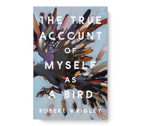
Project: The True Account Of Myself As A Bird
This was a freelance assignment with Penguin. A book of poetry, which means the door is even
further wide open for exploration. I tried some literal pieces, but the poems are packed with beautiful
and detailed imagery so working with the correct art was crucial. Summing up the entire collection
with one image was a delicate balance, but this painting was a sure fit and an immediate approval.
The True Account of Myself as a Bird - image: King of the Birds, 2013 (oil on linen), Nicola Bealing / Private Collection / © Nicola Bealing. All Rights Reserved 2022 / Bridgeman Images
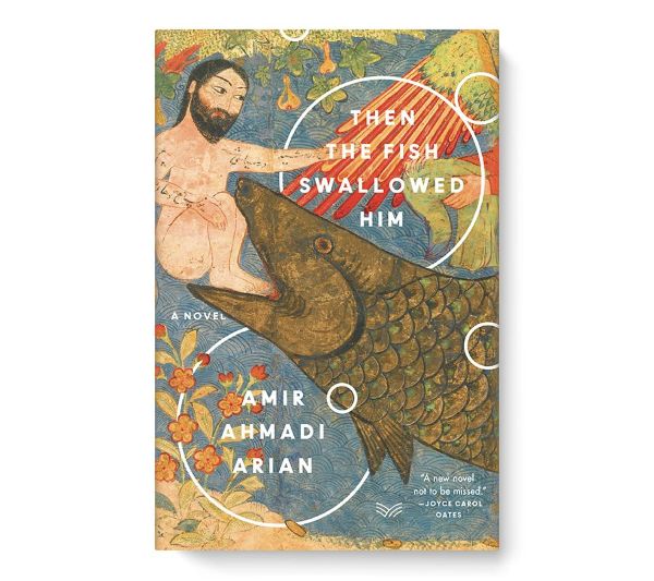
Project: Then The Fish Swallowed Him
One of the first titles that HarperVia published in early 2020, the novel is about a bus driver in
Tehran who finds himself in prison and relates to being in the belly of the fish. The painting of Jonah
and the Whale was relevant in terms of its message and aesthetic. It was also a challenge to combine
a historical image with a contemporary treatment, but I like to think of cover design as a puzzle; what
pieces fit best to make the message clear and intriguing?
Then The Fish Swallowed Him - image: Jonah and the Whale, c.1400 (ink, watercolour, gold and silver on paper), Persian School, (15th century) / Metropolitan Museum of Art, New York, USA / Bridgeman Images
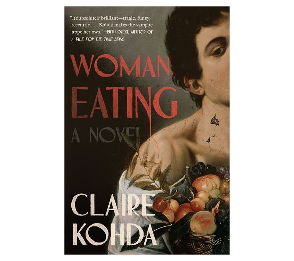
Project: Woman Eating
We used the Caravaggio for this, and again this single painting captured everything we needed for
the cover art. It was designed by Alicia Tatone and I art directed. Alicia and I work well together
because we visualize text similarly. I think it's important as an art director to work with designers
who will really dive into the brief and be passionate about the project. When art directing, I kind of
step back and try to view it as a publisher or an outsider would and then start to chip away. I think it's
key to wear a few hats at once – to approach it from a distance, from a different perspective and then
revisit to make work stronger.
Woman Eating - image: Youth with a Basket of Fruit, 1593-94 (oil on canvas) , Caravaggio, Michelangelo Merisi da (1571-1610) / Galleria Borghese, Rome, Lazio, Italy / Bridgeman Images
The Bridgeman Images archive is vast. I'll go to Bridgeman first for historical images, but I've also
searched the Bridgeman Studio for contemporary artists many times over the last few months. I'll
spend some time looking through the Studio, because there might be a style that jumps out - whether
I'm looking for a particular piece or I just want to see what kind of styles are being represented. I've
spent so much time digging through the site and it's a great resource to have for both contemporary
and historical options.
Need help?
Can not find what you are looking for? Contact us. We are always more than happy to help you with your research, at no obligation or additional cost.


